Getting Users to First Value: Designing Thena's Onboarding Journey
How product design drove 40% activation and 50% conversion to paid.

Company
Thena, AI native B2B customer support platform
Role
Designer -> Growth strategist
Date published
November 14, 2025
Overview
Thena is a B2B SaaS customer support platform serving clients in the US, Europe, and West Asia. After leading a major product overhaul, we shifted strategy—the new platform would be product-led rather than sales-led. I owned designing the entire user journey from signup to active usage.
The result: 40% of signups reached their first activation milestone, and 50% of activated users converted to paid. Once users experienced value, the product sold itself. My job was designing the path to get them there.
The Problem
With a new product-led strategy, we faced a core design challenge: how do we get users from signup to actually experiencing value?
The product was powerful but complex—a customer support platform with Slack integration, ticketing, AI features, and workflows. Users who "got it" loved it. But too many signed up and never made it to that first moment of value.
We needed to:
Guide users through a multi-step setup without losing them
Show the product's value before asking for commitment
Surface the right features at the right moments
Turn signups into active, engaged users
My Role
I owned the user journey end-to-end; not just the visual design, but the entire experience of getting users from signup to active usage. This meant:
User journey design: Mapping the path from signup to first value, identifying friction points
Onboarding flows: Designing empty states, guidance flows, and progressive disclosure
Behavioral analysis: Running daily queries to understand where users dropped off and why
Email sequences: Writing and designing automated campaigns to bring users back
Frontend implementation: Shipping onboarding features in code to accelerate iteration
Pricing input: Using adoption data to inform pricing tier restructuring
This wasn't a handoff-to-engineering situation. I was embedded in the problem, analyzing data, designing solutions, and shipping code.
What I designed
1. Understanding the Drop-off Points
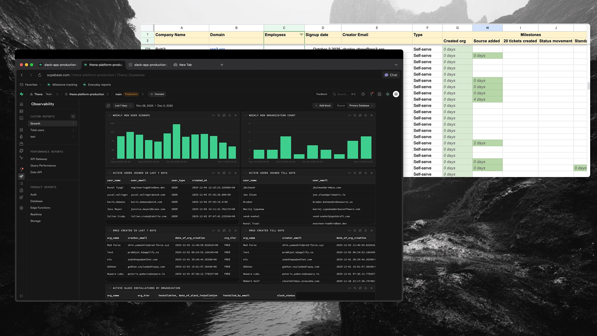
Before designing solutions, I needed to understand where users were getting stuck. I built a tracking system using SQL queries in Supabase to monitor user progression through key milestones:
Signup → User creates account
Source connected → User adds Slack/email integration
First ticket → Data starts flowing into the system
20 tickets → Meaningful usage threshold
Active usage → Regular engagement with the product
I also tracked micro-milestones within each stage. For source setup specifically: app installed → authenticated → added to channels → configured.
The insight: The biggest drop-off was between signup and source connection. Users were creating accounts but not completing the integration setup. Without connecting a source, they'd never see a ticket, never experience the product's value.
This told me exactly where to focus: design the path from signup to first ticket.
2. Empty States That Teach, Not Just Display
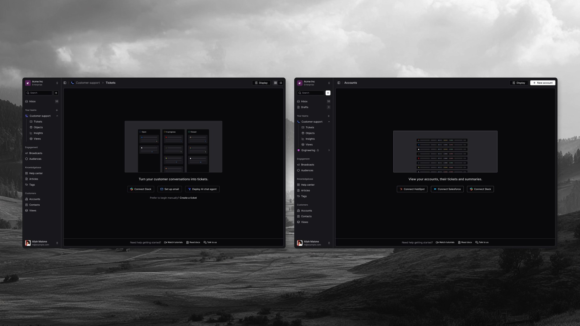
When users landed on pages without data, they'd see... nothing. A blank screen. No guidance on what to do next.
I redesigned empty states across the product to serve as onboarding moments—showing users what value they'd get and exactly how to get there.
Tickets page (the main dashboard): Instead of a blank board, users saw a preview of what their Kanban board would look like once populated. Open, In Progress, Closed columns with placeholder tickets. Below: "Turn your customer conversations into tickets" with three clear paths (Connect Slack, Set up email, Deploy AI chat agent) and a manual fallback option.
Accounts page: Showed a preview of what populated customer data would look like, with integration buttons (Connect HubSpot, Connect Salesforce, Connect Slack) and help resources at the bottom.
AI Agents page: Users saw a preview of what AI agents could do—"Ask, analyze, and act through your AI copilot"—with clear value props and a single call-to-action to start a free trial.
AI Chat Threads: Demonstrated the capability ("Understands context, resolves instantly, and gets smarter") alongside a code snippet showing how easy integration was.
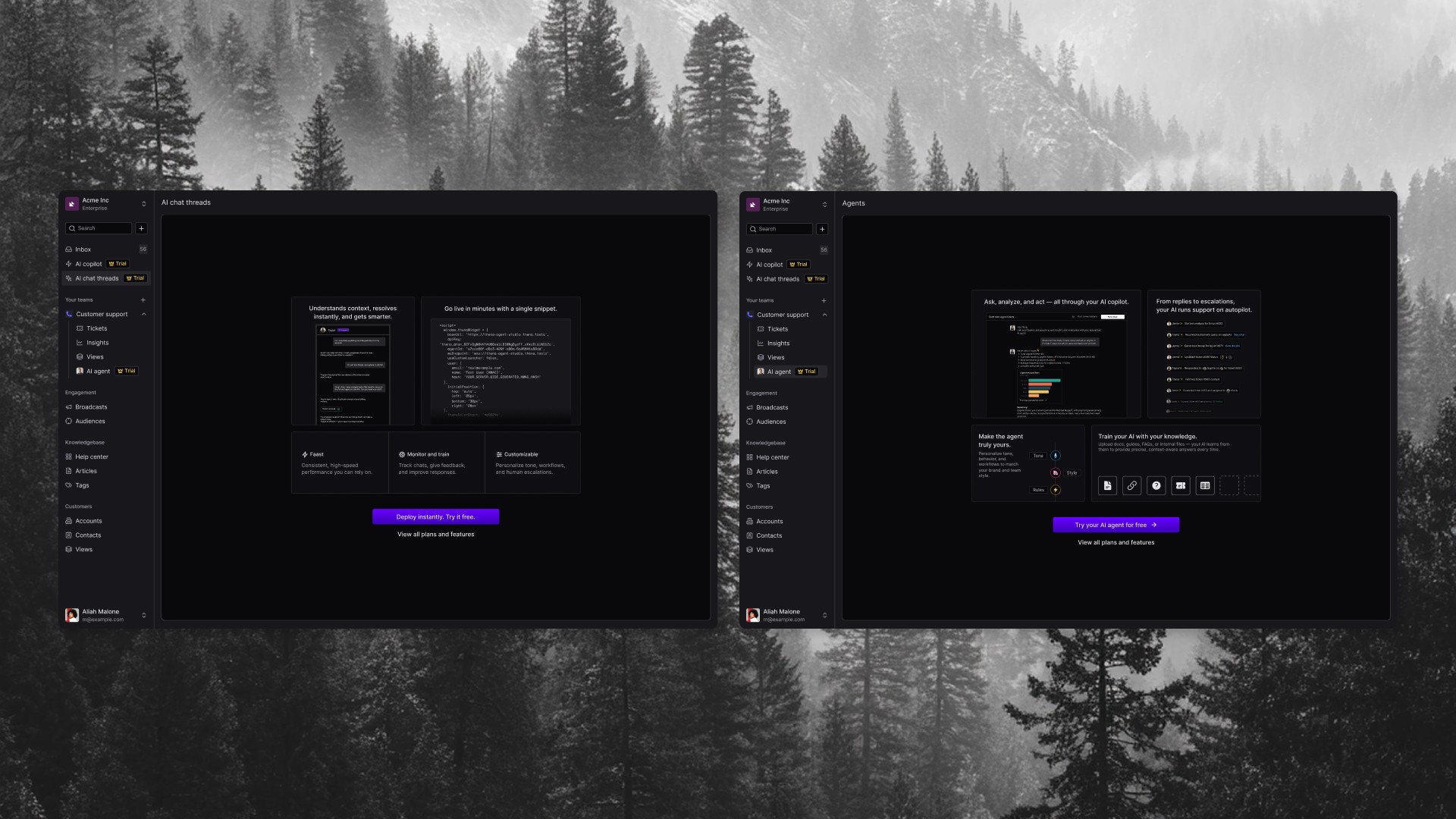
These weren't just prettier empty states. They were mini product demos, showing value before asking for commitment.
Onboarding Guide & Contextual Prompts
Beyond empty states, I designed a dedicated onboarding guide — a step-by-step checklist that guided users through setup with clear progress tracking.
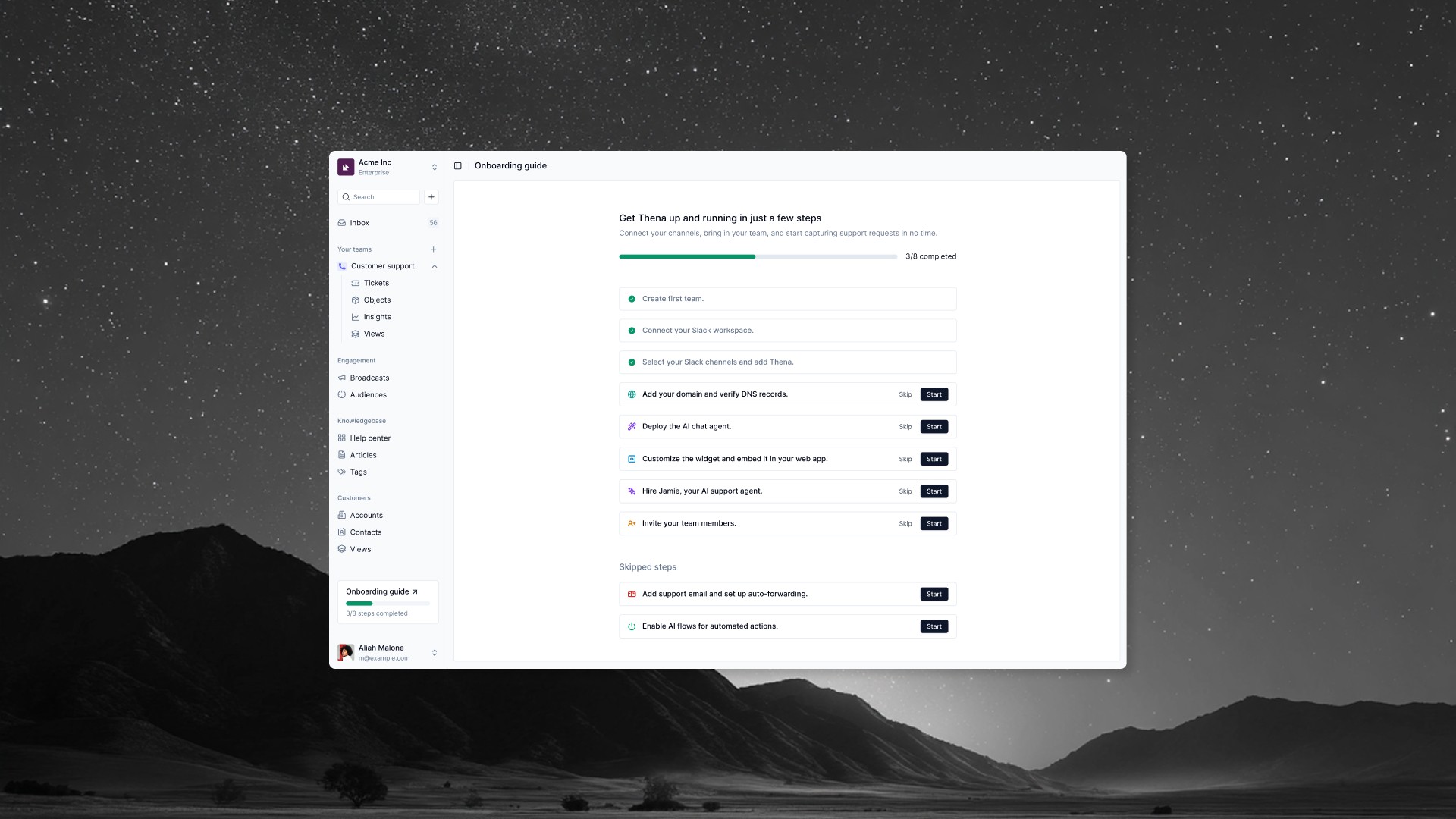
The guide showed users the full journey upfront: Create team → Connect Slack → Select channels → Add domain → Deploy AI agent → Customize widget → Hire Jamie (AI support agent) → Invite team members. Each step had Skip and Start options, and skipped steps were tracked separately so users could return to them later.
A persistent sidebar widget showed progress ("3/8 steps completed") so users always knew where they stood.
I also designed contextual prompts throughout the product to surface features at the right moments:
Sidebar upgrade nudge: Persistent indicator showing users what they'd unlock with a trial
AI feature discovery: In the conversation view, prompts like "Let Thena's AI draft a clear TL;DR and next steps" introduced AI capabilities in context
AI logs with trial badge: Showing what AI already did to create urgency — "Tired of manual updates? Let AI manage this ticket"
Hover tooltips: Micro-interactions on status fields showing automation potential
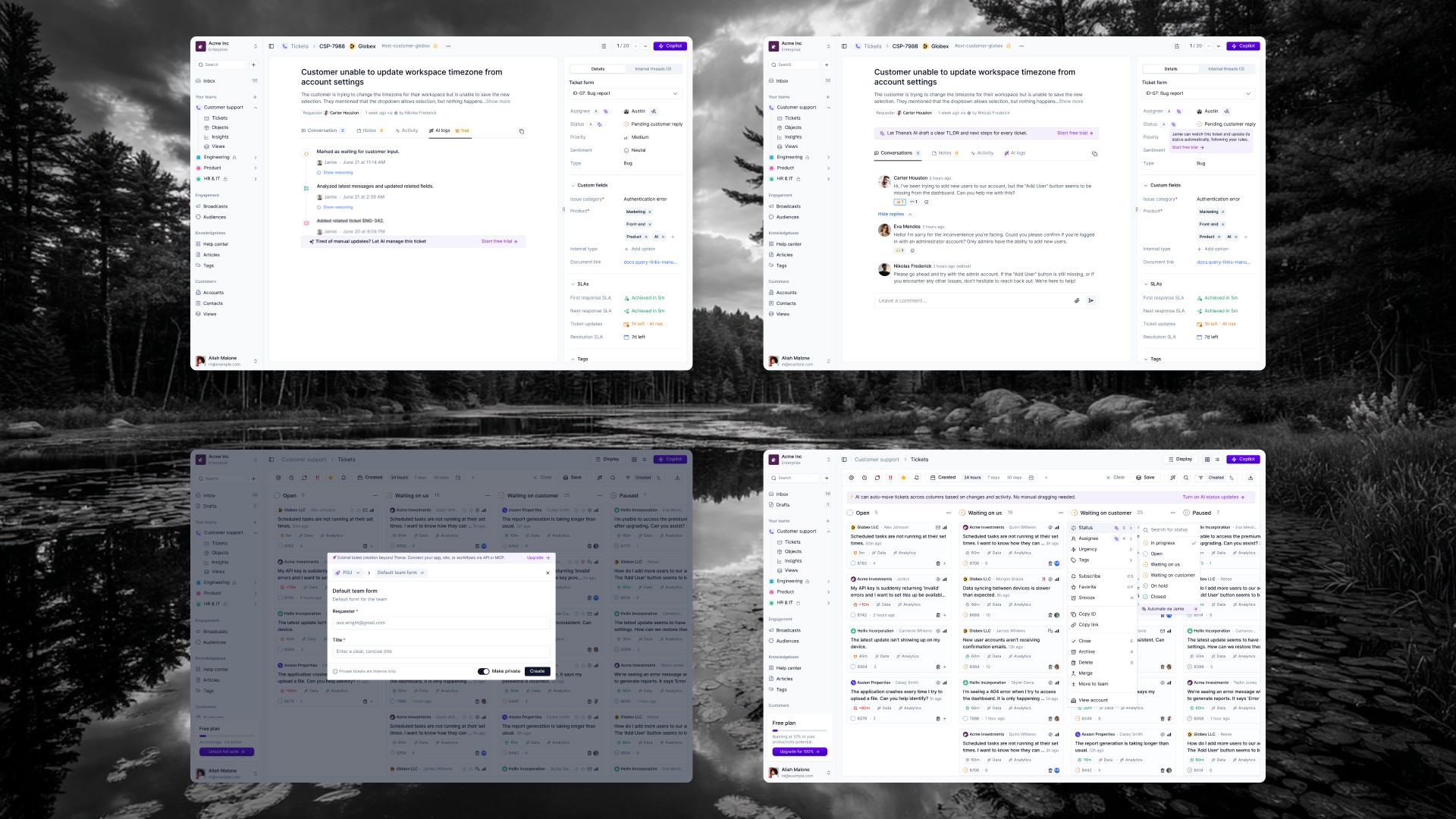
The principle: show features at the moment users would want them, not in a feature tour they'll skip.
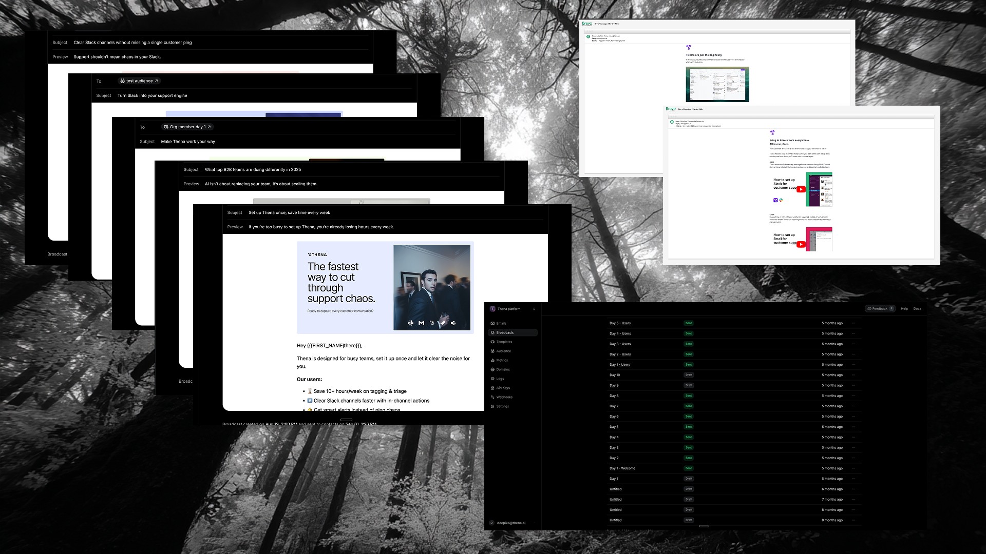
4. Email Sequences for Re-engagement
Not everyone completes setup in one session. I designed automated email sequences to bring users back and guide them to the next step.
For organization admins: A 10-day sequence aligned to their setup journey, each email focused on a specific milestone (connect Slack, see your first ticket, explore AI features).
For invited team members: A shorter 5-day sequence focused on getting productive within an existing workspace.
I owned the full stack: copywriting, visual design, segmentation logic, and technical implementation in Brevo & Resend. The emails weren't marketing, they were product guidance delivered via email.
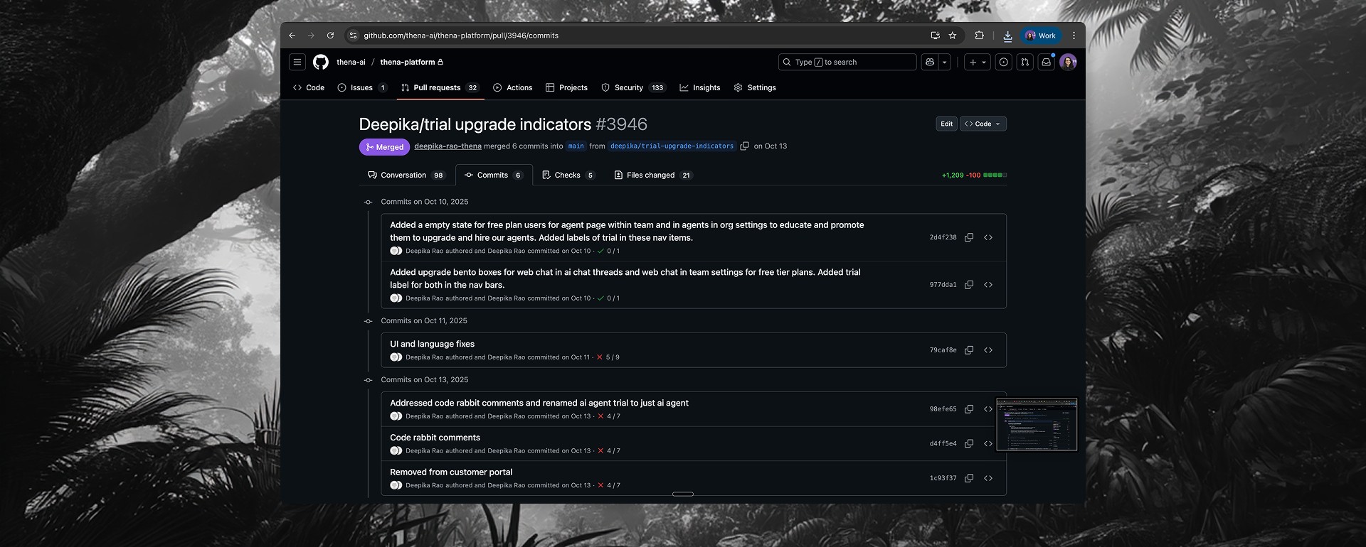
5. Shipping in Code
Beyond design, I wrote and shipped frontend code for growth features. One significant PR touched 21 files with 1,200+ lines of changes, implementing:
Trial upgrade indicator modals: Interactive previews with animated demonstrations of AI features
AI feature bento boxes: Visual layouts showcasing capabilities at upgrade touchpoints
Empty state components: Reusable patterns across multiple pages
This collapsed the iteration cycle. When data showed a drop-off point, I could design a solution and ship it within days, not weeks.
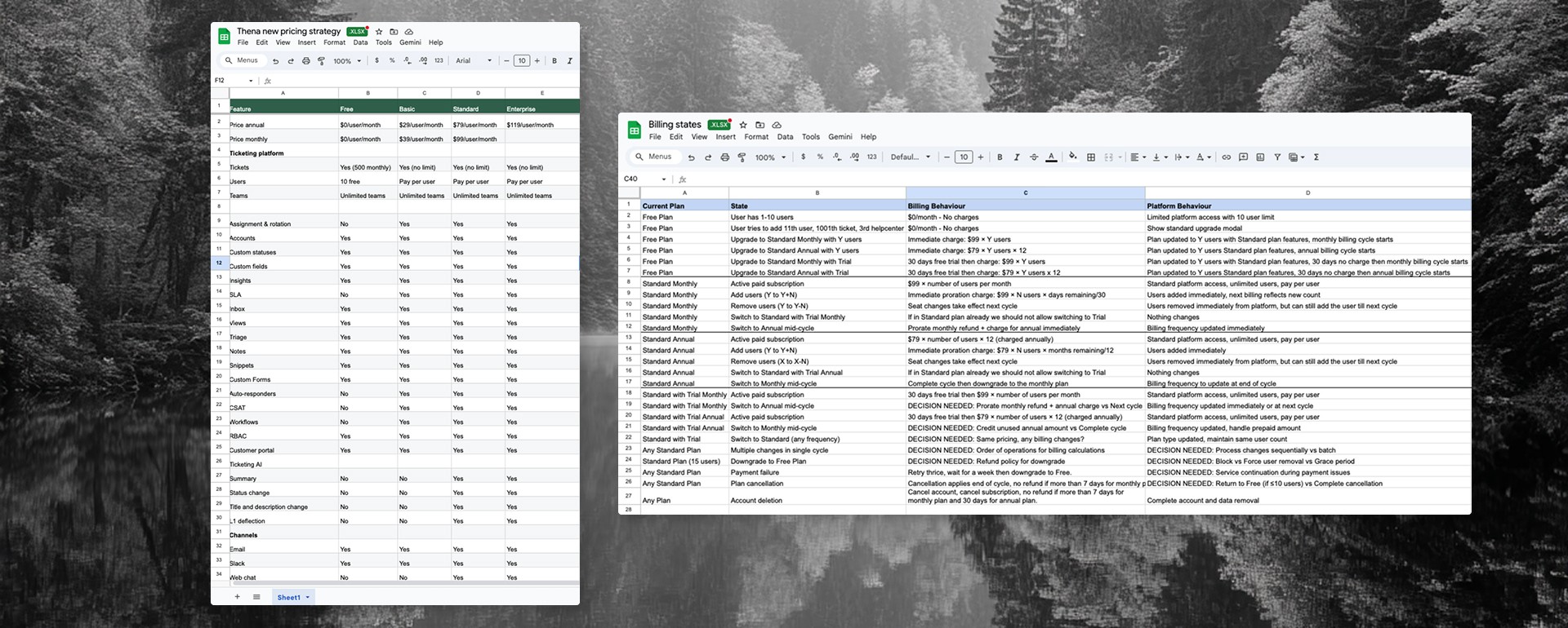
6. Informing Pricing Strategy
The adoption data revealed a secondary insight: users who loved the free tier weren't converting—not because they didn't see value, but because the jump to paid ($79/user/month) felt too steep.
The diagnosis:
Free tier was too generous (1,000 tickets/month, 10 users, 2 help centers)
No middle ground between free and $79/user
Users couldn't experience premium value before the trial decision
The solution I proposed: Introduce a Basic tier at $29/user/month as a stepping stone. Move features from free to Basic (SLA, workflows, auto-responders, integrations, APIs). Tighten the free tier limits (500 tickets instead of 1,000). This created a clearer value ladder: Free → Basic → Standard → Enterprise.
I also owned the billing states documentation, a comprehensive spec covering every possible user state and billing scenario (upgrades, downgrades, proration, payment failures, cancellations). This guided the engineering team's Stripe implementation and ensured we handled edge cases correctly.
Impact
40% of signups reached first value (first ticket in the system)
50% of activated users converted to paid — once users experienced value, the product sold itself
Identified the critical drop-off: signup → source connection was where we lost most users, focusing design efforts on that gap
Reduced time-to-value through contextual onboarding that met users where they were
Informed pricing restructure that created a clearer path from free to paid
Reflection
This project fundamentally changed how I think about product work. I came in as a designer and left understanding that growth, product, and revenue are inseparable. The funnel isn't something that happens after you ship features, it's part of the feature.
Key learnings:
Pricing is a design problem. The gap between free and paid tiers was a UX issue, not just a business decision.
Data reveals intent. Heavy usage without conversion wasn't a marketing problem, it was a value perception problem. Users loved the free tier too much.
Context beats interruption. Upgrade prompts worked best when tied to the exact moment users would want that feature, not as random pop-ups.
Code accelerates everything. Being able to implement growth features myself collapsed iteration cycles significantly.
The PLG experiment validated important hypotheses and provided clear direction for future iteration. Building this system from scratch, wearing every hat from strategy to code was one of the most comprehensive learning experiences of my career.

