The Design Overhaul That 20x'd Product Usage
How I turned a design bottleneck into an accelerator—taking product usage from 600 to 12,000 minutes/week.

Company
Thena, AI native B2B customer support platform
Role
Founding Product Designer
Date published
October 6, 2024
The Situation
March 2024. Thena was at a crossroads.
The product had grown organically over past 12 months, feature by feature, without a cohesive design vision. What we'd built worked, technically. But customers were frustrated, and the numbers showed it.
Product usage had dropped to ~600 minutes per week. Customers were churning. Competitors were catching up. The founders made a hard call: pause growth efforts, shift full attention to product. Fix this or lose clients.
And these weren't just any customers. Thena's customer base included Mixpanel, Amplitude, Braze, ClickHouse, Vercel, Metronome, Incident.io, companies known for building exceptional products themselves. They had high standards. They knew what good software looked like. And they were telling us, directly and indirectly, that we weren't meeting that bar.
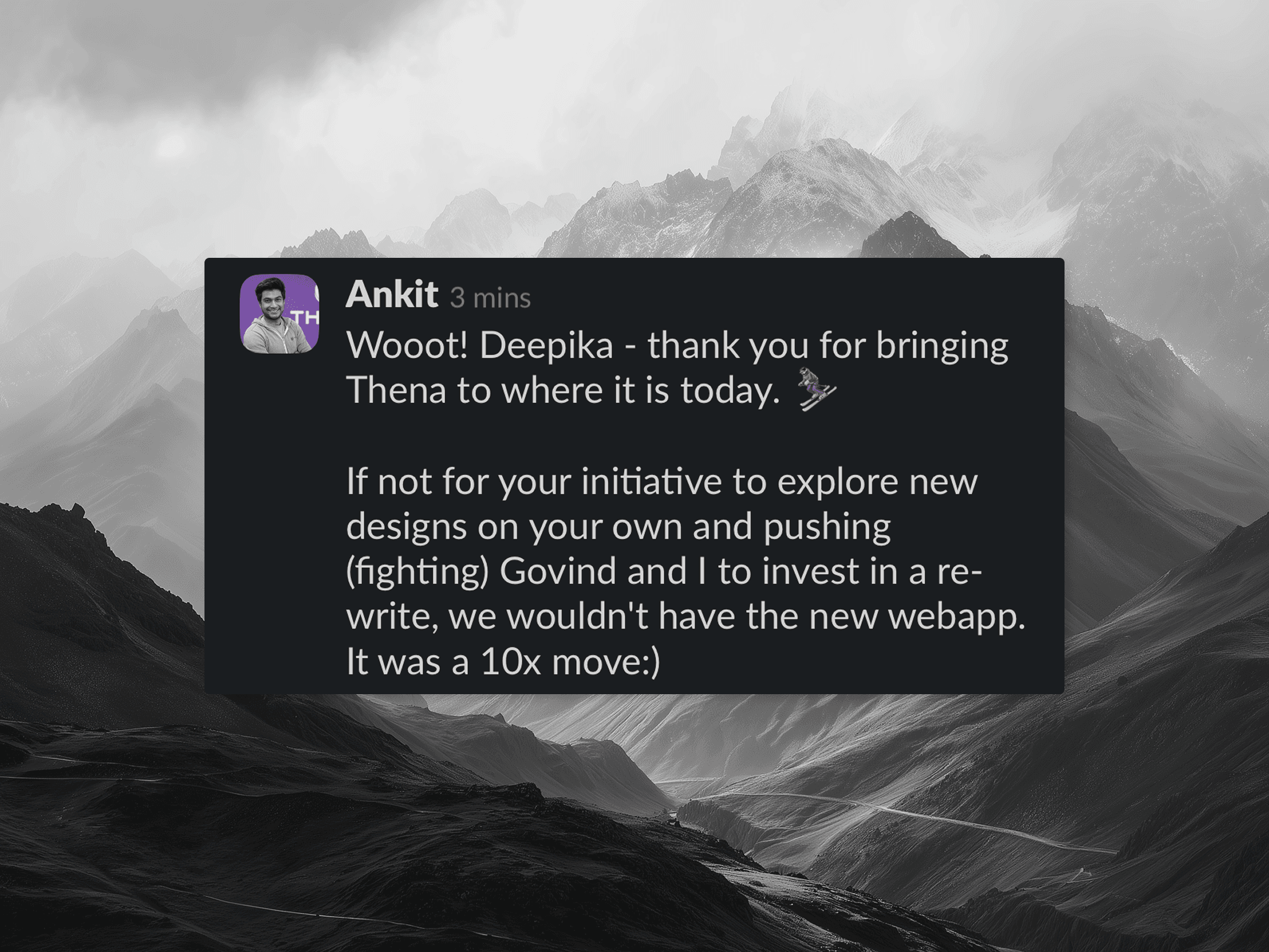
I was the founding designer—and until this point, I'd been making incremental improvements to what existed. But this moment demanded something different. It was time to step into true founding designer responsibility: not just improving the product, but owning it completely. Rebuilding it from the ground up.
The Problems
When I audited the product, the issues weren't subtle. They were everywhere, compounding on each other, making the entire experience feel broken.
Problem 1: The Navigation Was a Guessing Game
The old navigation had no clear structure. Even with the sidebar expanded, there was no hierarchy—just a flat list of items with no groupings, no visual distinction between sections, nothing to help users understand how the product was organized.
Settings were buried under multiple layers. To find account configuration, users had to click through three or four screens, each time wondering if they were in the right place. There was no visual hierarchy—everything felt equally (un)important.
Account configuration and settings were particularly confusing. There was no clear hierarchy of what lived where. Settings that belonged together were scattered across different sections. Users couldn't build a mental model of the product's structure because there wasn't one—at least not one that was visible to them.
The worst part: different sections of the app felt like different products. Customer Requests lived in one mental model. Marketing Automation (that's what we called Broadcasts) lived in another. Settings was a maze. Users would get lost, give up, or worse, stop using features they were paying for.
What users experienced: Confusion. Frustration. "Where do I find X?" support tickets. Abandoned workflows.
Problem 2: The Kanban Was Unusable at Scale
The request management view, the core of the product, had minimal filtering. A few basic dropdowns. No way to save views. No clear visual feedback on what filters were active.
But filters were just one part of the problem. There was no ability to customize the board. You couldn't choose which columns to show, how to group requests, or what information mattered to your workflow. Everyone got the same rigid view, regardless of how they actually worked.
The cards themselves were poorly designed. The design language was inconsistent—different card sizes, inconsistent spacing, typography that didn't follow any system. More critically, there was no valuable information shown on the card. You couldn't tell at a glance what a request was about, how urgent it was, or who was handling it. And you couldn't perform any actions directly on the card, every interaction required opening the full drawer.
For a support team managing hundreds of requests, this was a disaster. They couldn't slice their queue by assignee, customer, priority, or time range in any meaningful way. Everything felt like a flat, undifferentiated list.
What users experienced: Overwhelm. Missed requests. "I can't find anything" complaints. Teams building workarounds in spreadsheets.
Problem 3: The Ticket Drawer Was Information Chaos
When you opened a request, a drawer would slide in. But it competed with the main view rather than complementing it. Information was scattered without clear hierarchy. You couldn't tell at a glance what mattered.
Critical context was missing or hard to find:
No SLA tracking visible
No sentiment analysis
No AI-generated tags
Custom fields buried or non-existent
Conversation threading was unclear
No quick actions for common operations
The drawer felt cramped. Buttons were different sizes. Interactive elements behaved inconsistently. Some things were clickable, others weren't, and there was no visual language to distinguish them.
What users experienced: Slow resolution times. Context-switching. "I need to open Slack to see the full picture" workarounds.
Problem 4: Settings Were Overwhelming and Slow
The Global Settings page was a wall of configuration options with no clear organization. To manage channels and customers had hundreds of them, you'd face a basic table with minimal columns, buried pagination (some accounts had 12+ pages), and no bulk actions.
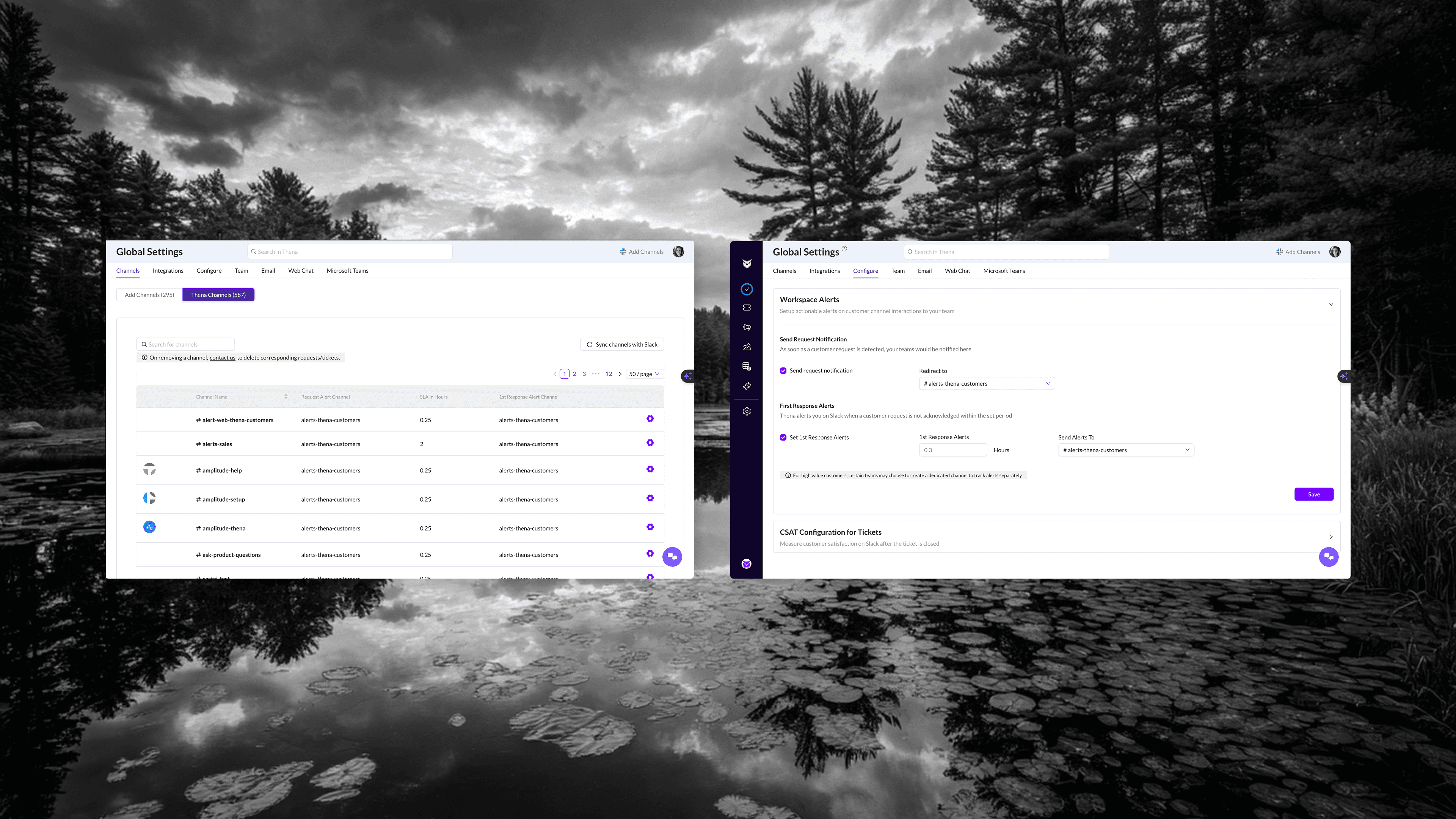
Want to configure a specific channel? Click into it. Want to configure another? Go back, find it, click into it. There was no inline editing, no multi-select, no way to apply settings across channels efficiently.
The deeper problem was discoverability. Users had no visibility into what settings they could actually configure for an account. The relationship between accounts and channels was confusing channels were indirectly linked to accounts, but that mental model was very Slack-specific and didn't translate well to the UI. Users didn't know what they could manage at an account level versus a channel level. Important configuration options were hidden, and there was no clear hierarchy showing the full scope of what was possible.
The account settings were worse. Configurations that should have been front and center were hidden under layers. Users didn't know what was possible because they couldn't find it. The UI was slow, different loaders for different sections, occasional breaks, nothing felt snappy or responsive.
What users experienced: Avoidance. "We just don't change our settings" became a common refrain. New features went unused because nobody could find them.
Problem 5: Broadcasts Felt Like an Afterthought
The Broadcasts feature (then called "Marketing Automation") was card-based, cluttered, and confusing. The naming itself was wrong, this wasn't marketing automation, it was customer communication.
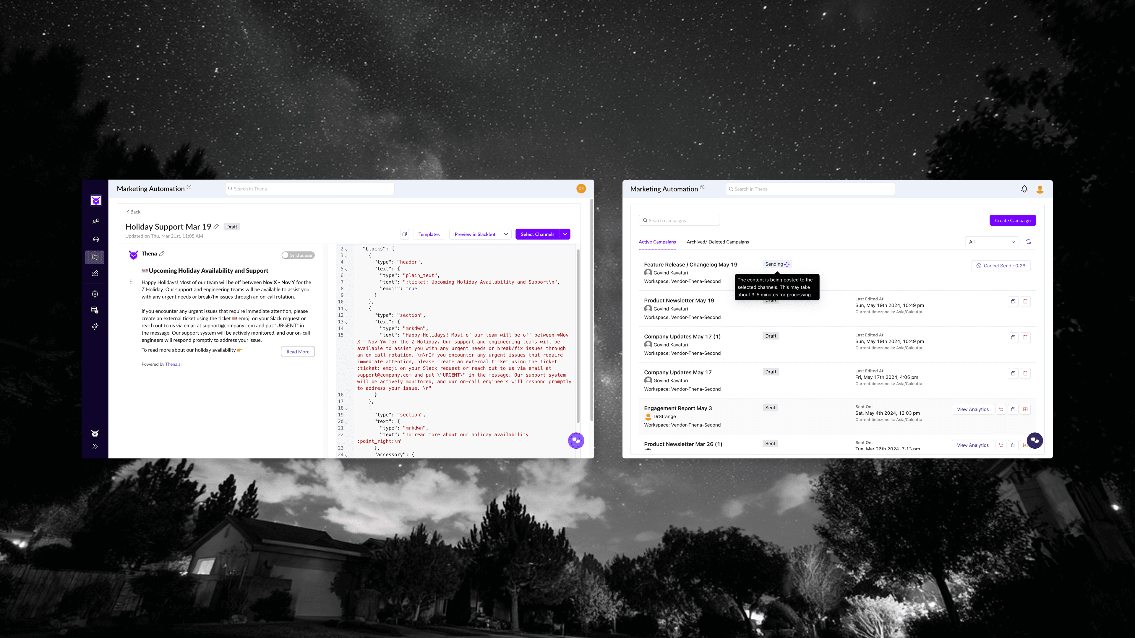
Creating a broadcast meant navigating a clunky modal flow. Template selection was basic. The editor showed raw JSON alongside the preview. Audience selection was buried in a separate modal with no clear feedback on who would receive the message.
But the biggest problem was editing. The whole point of a broadcast is to craft the right message, iterate on copy, adjust formatting, preview how it looks. Making edits should be effortless. Instead, users faced a JSON editor that required technical knowledge just to change a sentence. Non-technical team members, the people who often knew customers best and should have been writing these messages, couldn't use the feature at all without developer help.
There was no simple rich text editor. No WYSIWYG experience. Just raw code that intimidated anyone who wasn't technical.
There was no clear state management either. Drafts, sent, scheduled—all jumbled together in a single view with a basic filter dropdown.
What users experienced: Underutilization. Teams doing broadcasts manually in Slack instead of using the feature. "It's too complicated" feedback. A feature that should have driven engagement sitting unused.
Problem 6: Visual Inconsistency Everywhere
Across the entire product, nothing matched. Buttons were different sizes on different pages. Colors meant different things in different contexts. Some tables had hover states, others didn't. Loading states varied, spinners here, skeletons there, nothing in some places.
This wasn't a nitpick. Inconsistency creates cognitive load. Users couldn't build muscle memory. Every interaction required conscious thought: "How does this work here?" That friction compounded into fatigue, and fatigue compounded into abandonment.
What users experienced: The product felt unfinished. Unprofessional. Like it was held together with tape.
The Challenge
I had six weeks. One designer—me, stepping fully into the founding designer role for the first time. A junior engineering team. And a quality bar that couldn't slip.
We weren't just competing with Zendesk, Intercom, and Freshdesk. We were serving customers who built world-class products, Amplitude, Mixpanel, Braze, Vercel and many more. They'd spot shortcuts. They'd notice inconsistencies. If the redesign felt like a downgrade in any way, we'd lose them.
The constraint wasn't just time. It was how to ship fast without putting heavy pressure on front-end engineering. Every design decision needed to translate cleanly to code. No pixel-perfect heroics that would take weeks to implement. No custom components that would create maintenance debt.
I needed a system. And I needed it to already exist.
The Decision: ShadCN
I evaluated three options:
Material Design — The safe choice. But it looked dated. Every B2B product using Material looked the same, and not in a good way. We'd blend into a sea of mediocrity.
Untitled UI — Beautiful, comprehensive, but expensive and bloated. Too many components we'd never use. The Figma file alone would slow down my workflow.
ShadCN — Relatively new back then (~2,000 GitHub stars at the time). Open-source. Free. And critically: it came with a website where developers could copy component code directly.
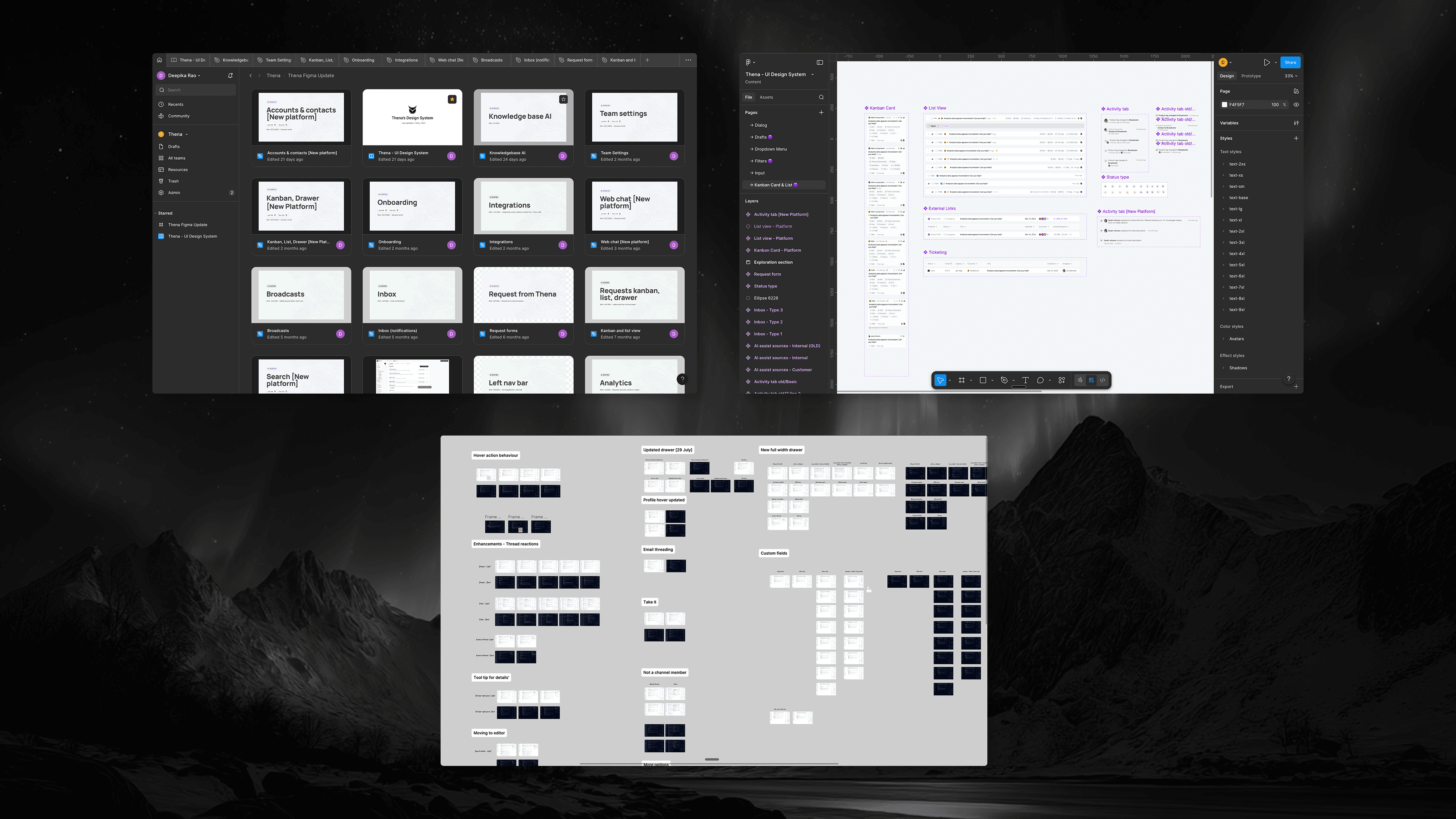
I found a basic community Figma file for ShadCN. It wasn't comprehensive, but it was a starting point. I built on top of it, adding every state, every variant, every edge case we'd need.
The bet: ShadCN's clean, minimal aesthetic would give us a modern look. The code availability would let engineers ship without waiting for custom implementation. The consistency would solve our fragmentation problem overnight.
It worked. That single decision picking the right design system cut design-to-code friction by ~30%.
How I Worked
Comprehensive Figma, Zero Ambiguity
I didn't hand off wireframes and wait for questions. I crafted every state in Figma:
For every component:
Default state
Hover state
Active/selected state
Disabled state
Loading state
Error state
Empty state
For every screen:
Full data
Partial data
No data (empty states with guidance)
Loading skeletons
Error recovery
The goal: engineers should never have to guess. If they're looking at the design and wondering "what happens when...?"—I've failed.
Rigorous Three-Part QA
Every feature went through three rounds of QA:
1. Functional QA: Does it work? Click every button. Fill every form. Try to break it.
2. Visual QA: Does it match the design? Pixel-level review. Spacing, alignment, colors, typography. If a button is 2px off, we fix it.
3. Experience QA: Does it feel right? Is it snappy? Are there unnecessary loading states? Does the interaction feel natural? This is where most teams stop too early.
The experience layer matters more than people think. A button can be functionally correct and visually accurate but still feel wrong if it has a 200ms delay. Users can't articulate this, but they feel it. They'll say "the product feels slow" without knowing why.
Direct Engineer Collaboration
No PM in between. I worked directly with the engineering team, most of whom were relatively junior. This was a feature, not a bug.
Junior engineers often care more about getting it right. They ask questions. They want to understand the "why." I could shape their taste in real-time, explaining why this padding matters, why that animation duration is too long, why we're using this pattern instead of that one.
By the end, they weren't just implementing designs. They were catching issues I missed. "This hover state feels weird, should we try X?" That's when you know the collaboration is working.
The Transformation
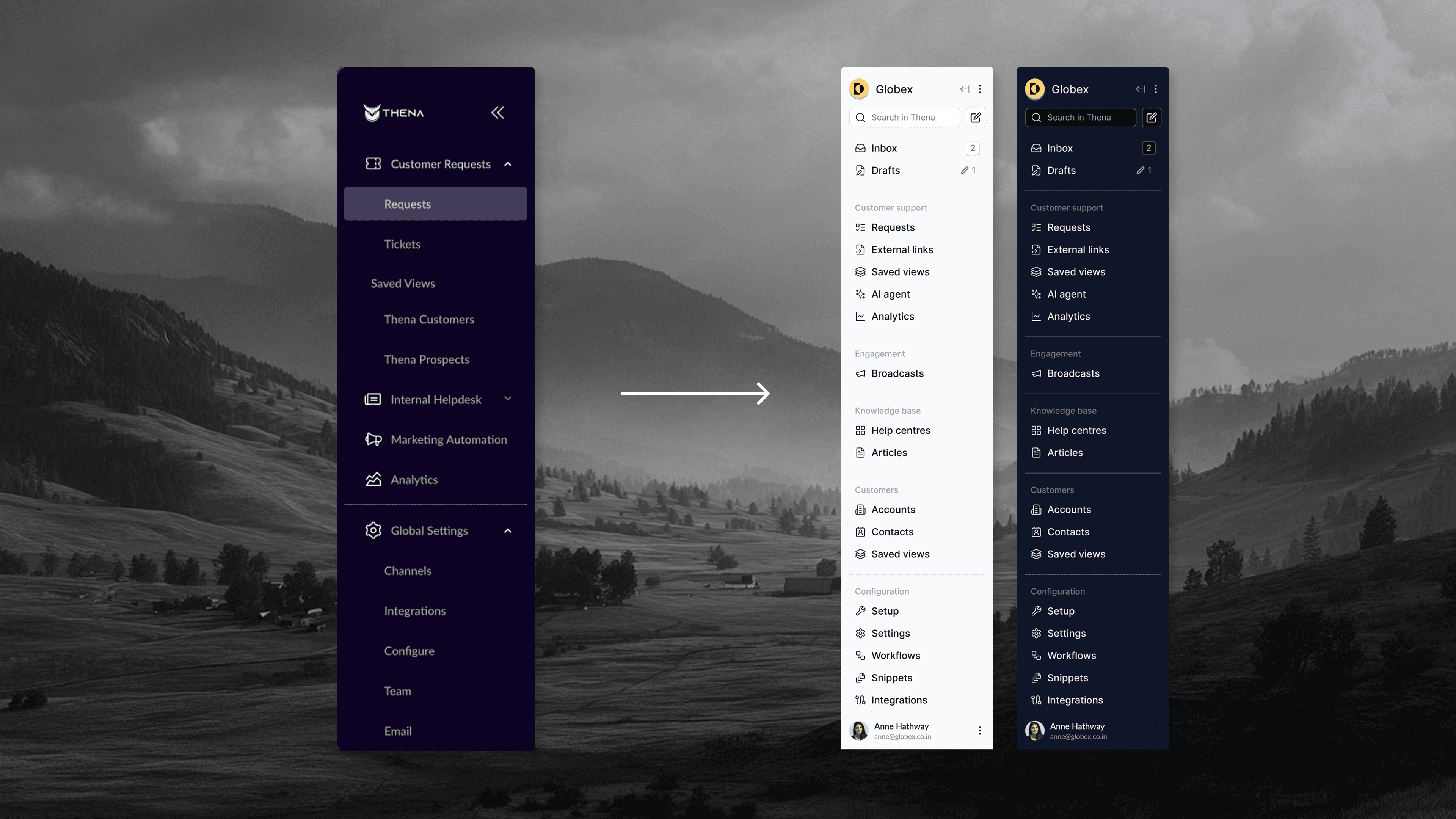
Navigation: From Guessing Game to Clear System
Before: Icon-only sidebar, no labels, no grouping, settings buried.
After: Labeled sidebar with clear section headers:
Customer support: Requests, Zendesk tickets, External links, Saved views, AI agent, Analytics
Internal helpdesk: Requests, Tickets, Saved views, AI agent, Analytics
Engagement: Broadcasts, Audiences
Customers (CRM): Accounts, Contacts, Saved views
Knowledgebase: Help centers, Articles
Configuration: Setup, Settings, Workflows, Snippets, Integrations, Admin
Collapsible groups. Workspace switcher at top. Clear visual hierarchy. You can tell at a glance where you are and where everything else lives.
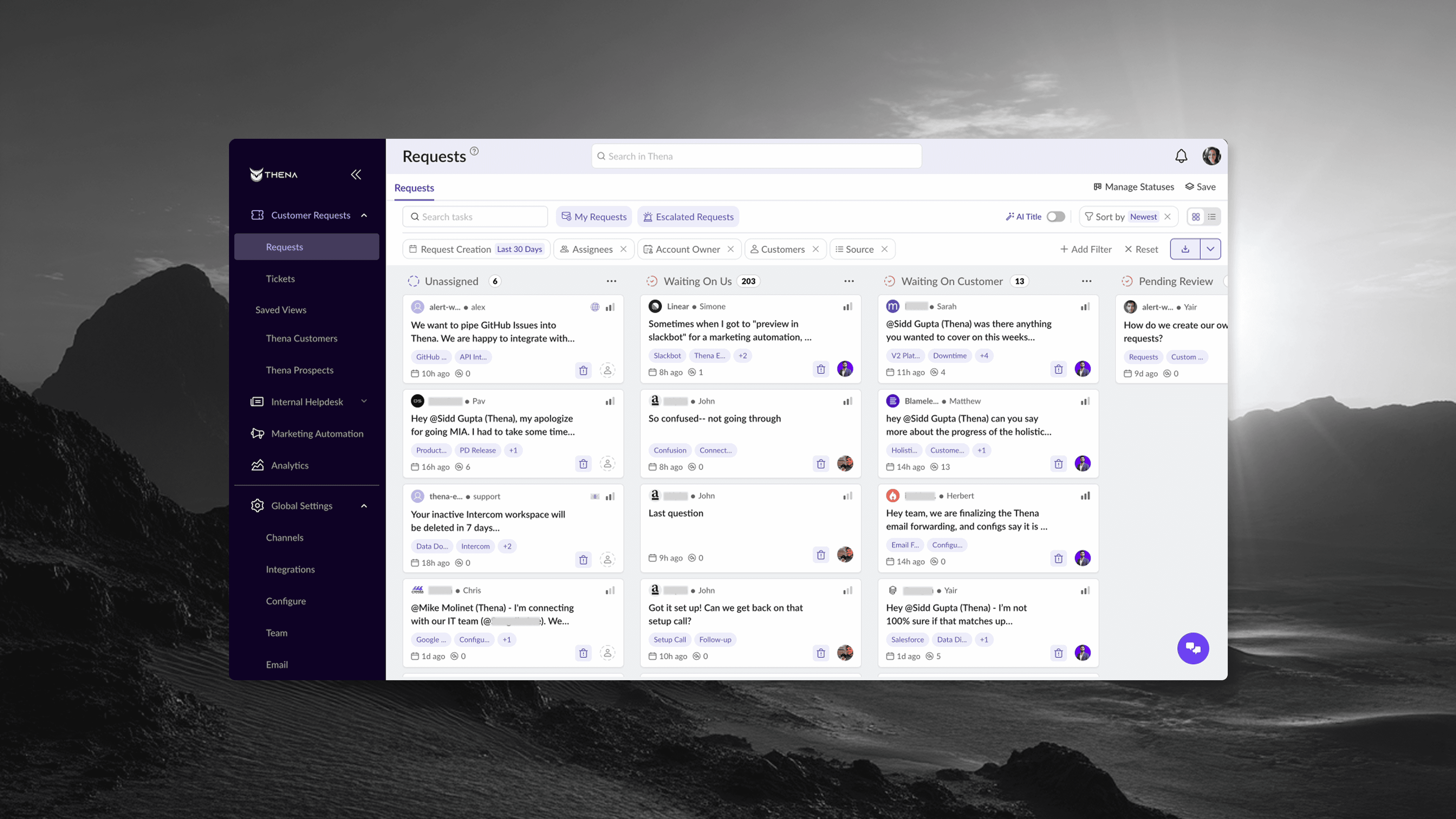
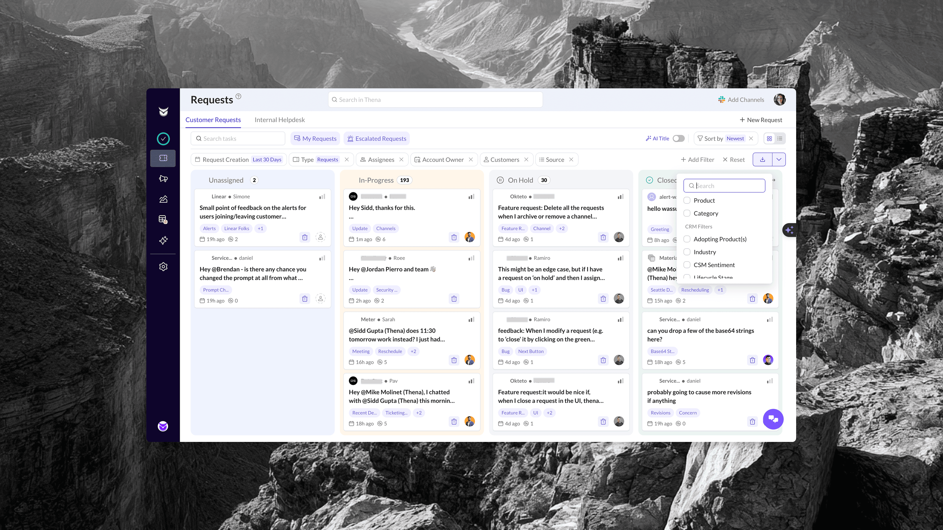
Kanban: From Flat List to Power Tool
Before: Basic dropdowns, no saved views, unclear filter states.
After: Robust filter bar with:
Date range (24 hours, 7 days, 30 days, all time, custom)
Multiple filter types (Assignees, Account Owner, Customers, Source, Category, Priority)
Visual chips showing active filters
"Match all filters" toggle for power users
One-click "Reset" to clear everything
Plus: Saved Views as a first-class feature. Users can create, name, and share filtered views. "Mike's Test Saved View" sits right in the sidebar, one click away.
The column headers now show counts. You know instantly: 8 waiting on us, 9 waiting on customer, 10 on hold, 38 closed. Information density done right.
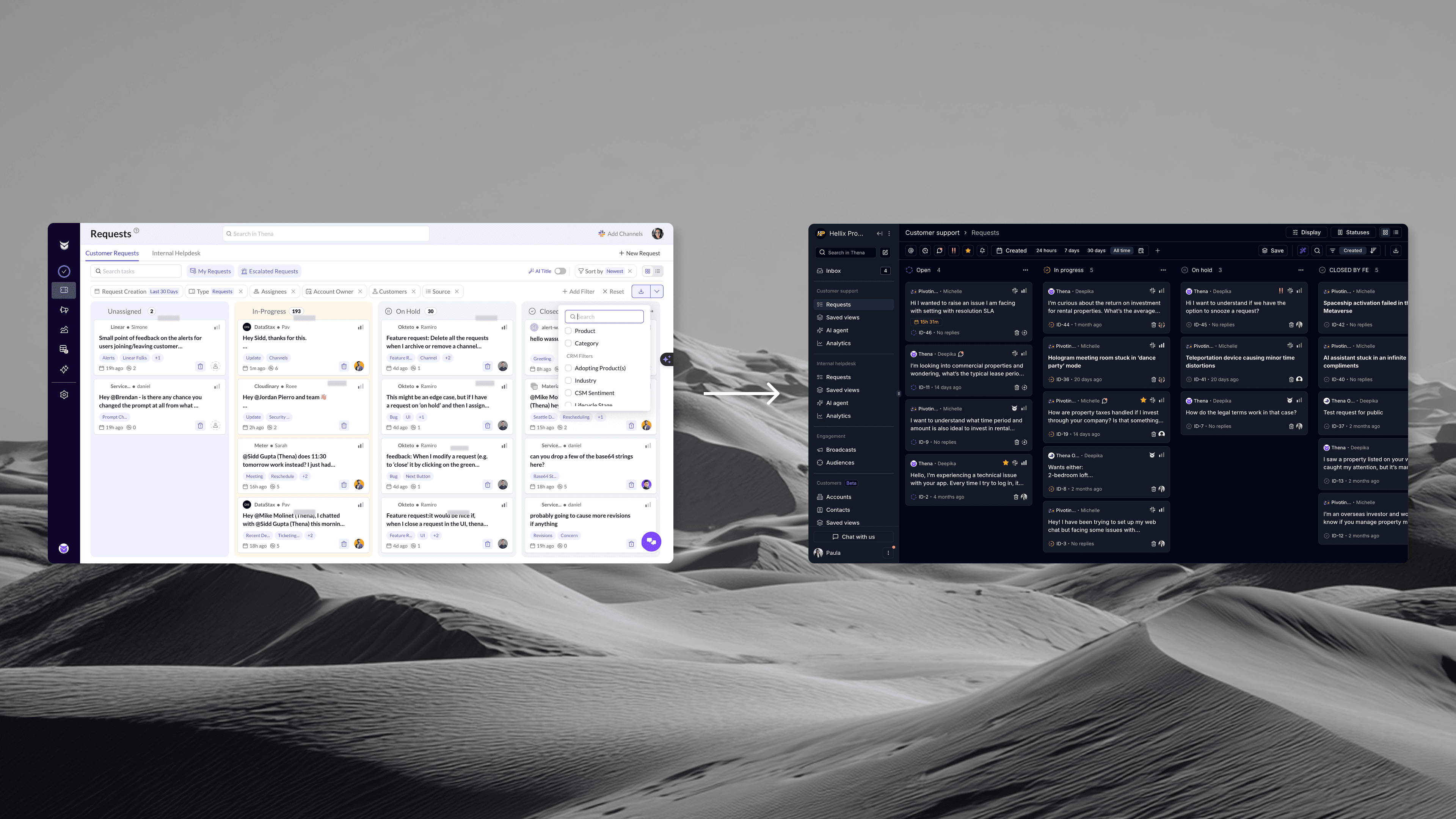
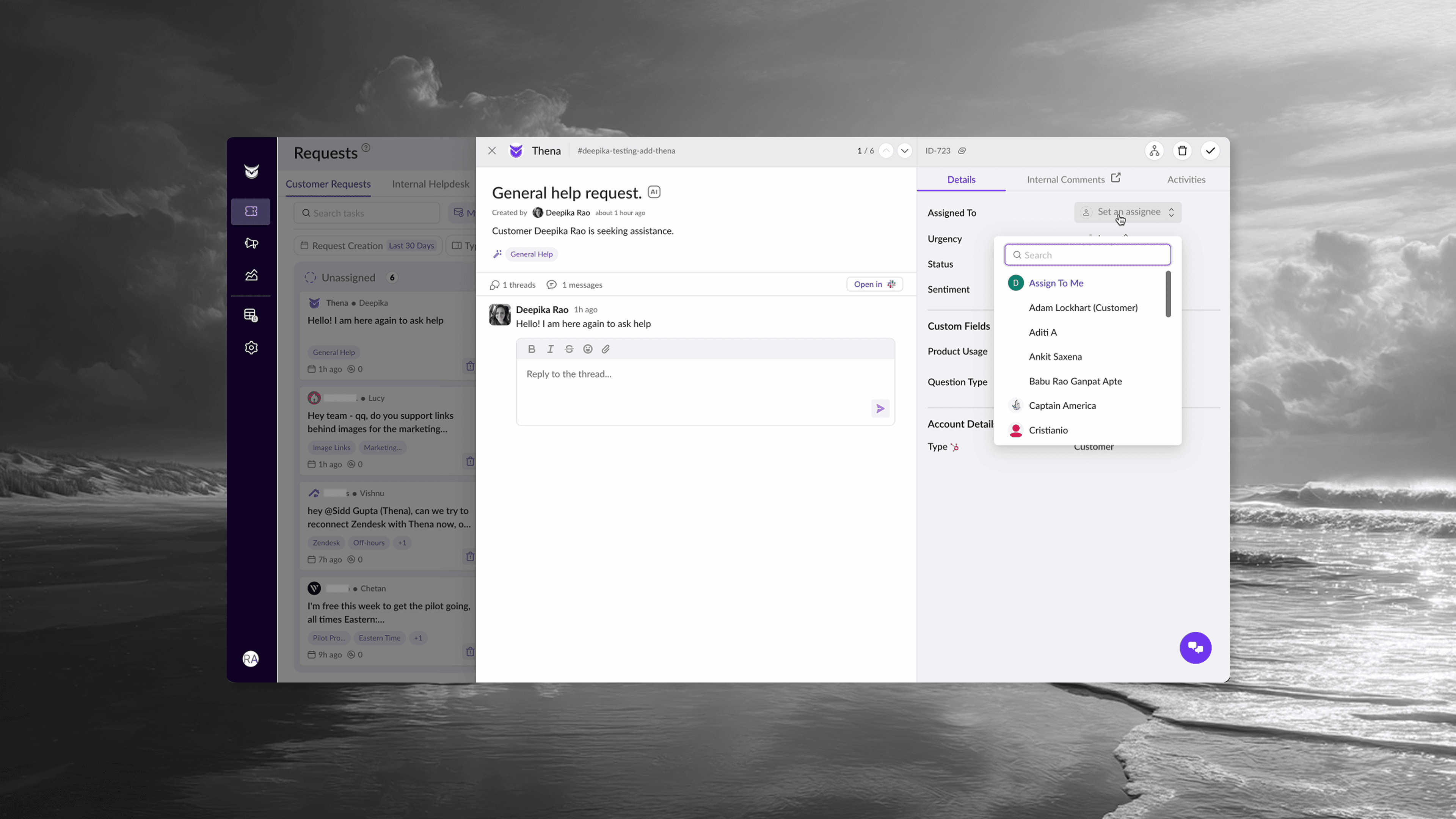
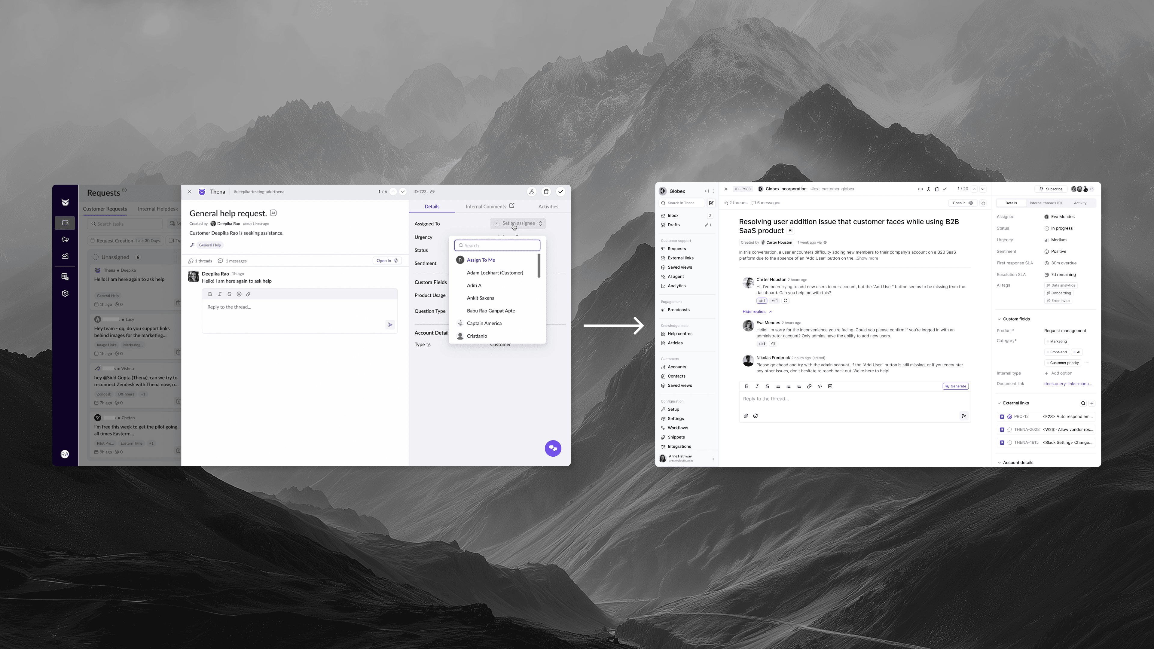
Ticket Drawer: From Chaos to Clarity
Before: Cramped drawer, scattered information, missing context.
After: Clean three-panel layout:
Left panel: Threaded conversation with full message history, reply box with formatting, AI-generated summary at top.
Right panel — Details tab:
Assignee (searchable dropdown)
Urgency indicator
Status with visual badge
Sentiment (AI-detected)
AI tags (auto-generated)
First response SLA (with "Achieved in 3m" success indicator)
Resolution SLA
Custom fields (expandable)
External links (Linear, Jira integration)
Account details
Recent requests from this account
Top bar: Request ID, account name, channel, navigation arrows, quick actions.
Everything a support agent needs, organized by how they actually work. Context at a glance. Deep details one click away.
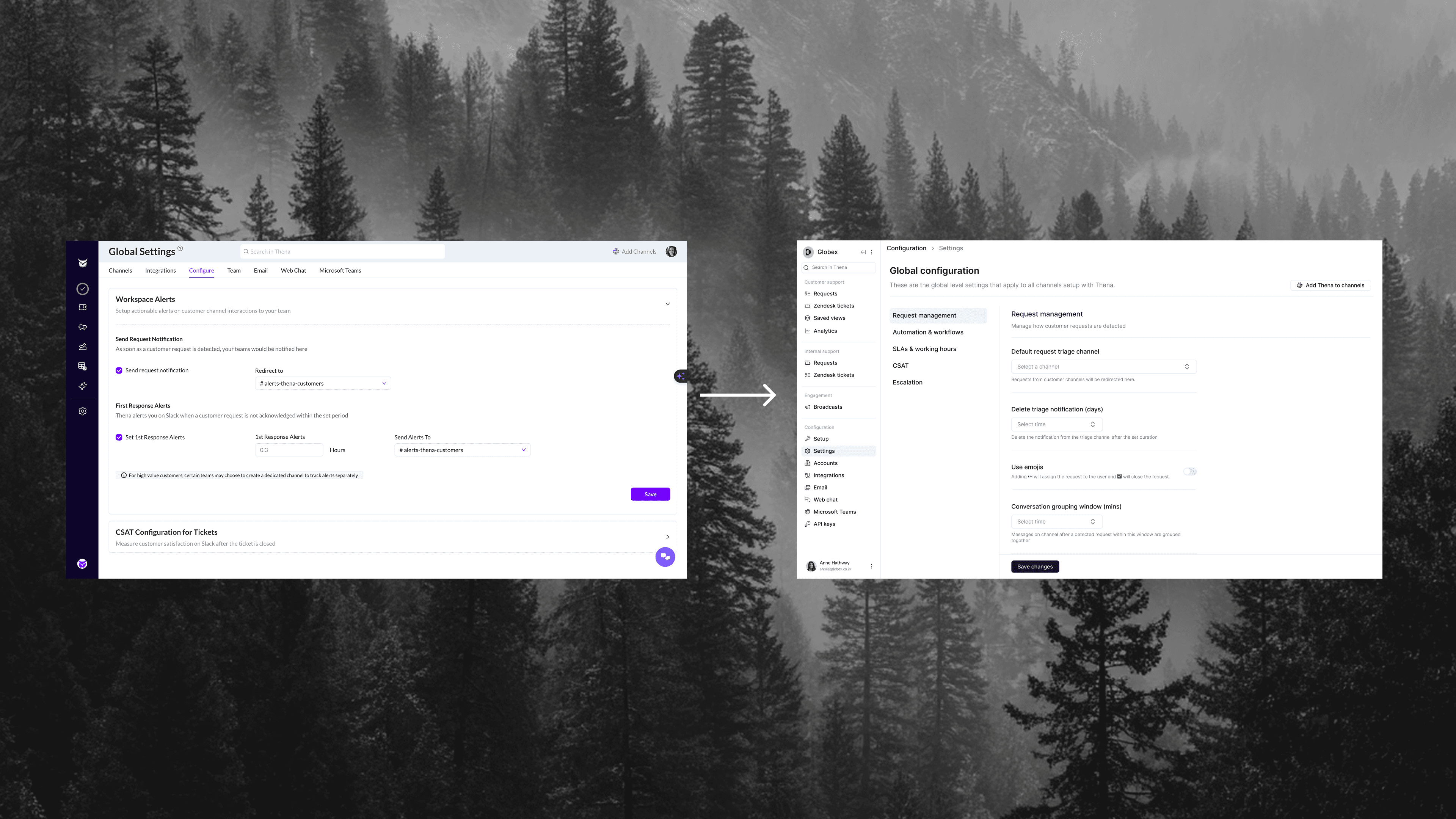
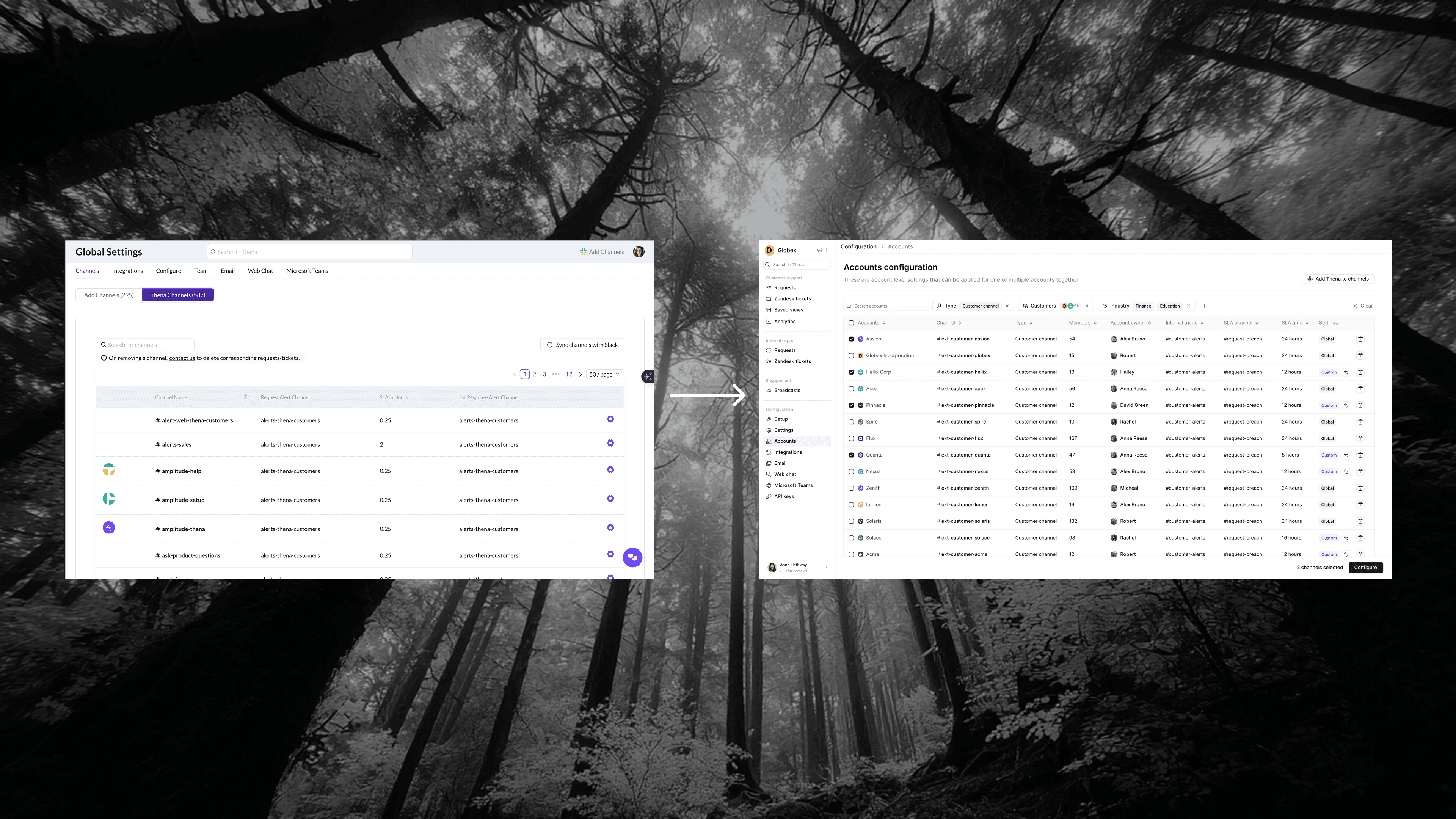
Settings: From Maze to Dashboard
Before: Wall of options, buried pagination, no bulk actions.
After: Clean table with:
Sortable columns (Account, Channel, Type, Owner, Internal triage, SLA channel, SLA time)
Multi-select checkboxes
"Configure" button for bulk operations
Search that actually works
Left sidebar with clear categories (Request management, Automation & workflows, SLAs & working hours, CSAT)
For account configuration specifically: a modern form layout with clear sections, visual toggles, inline help text, and a preview panel showing how changes will look.
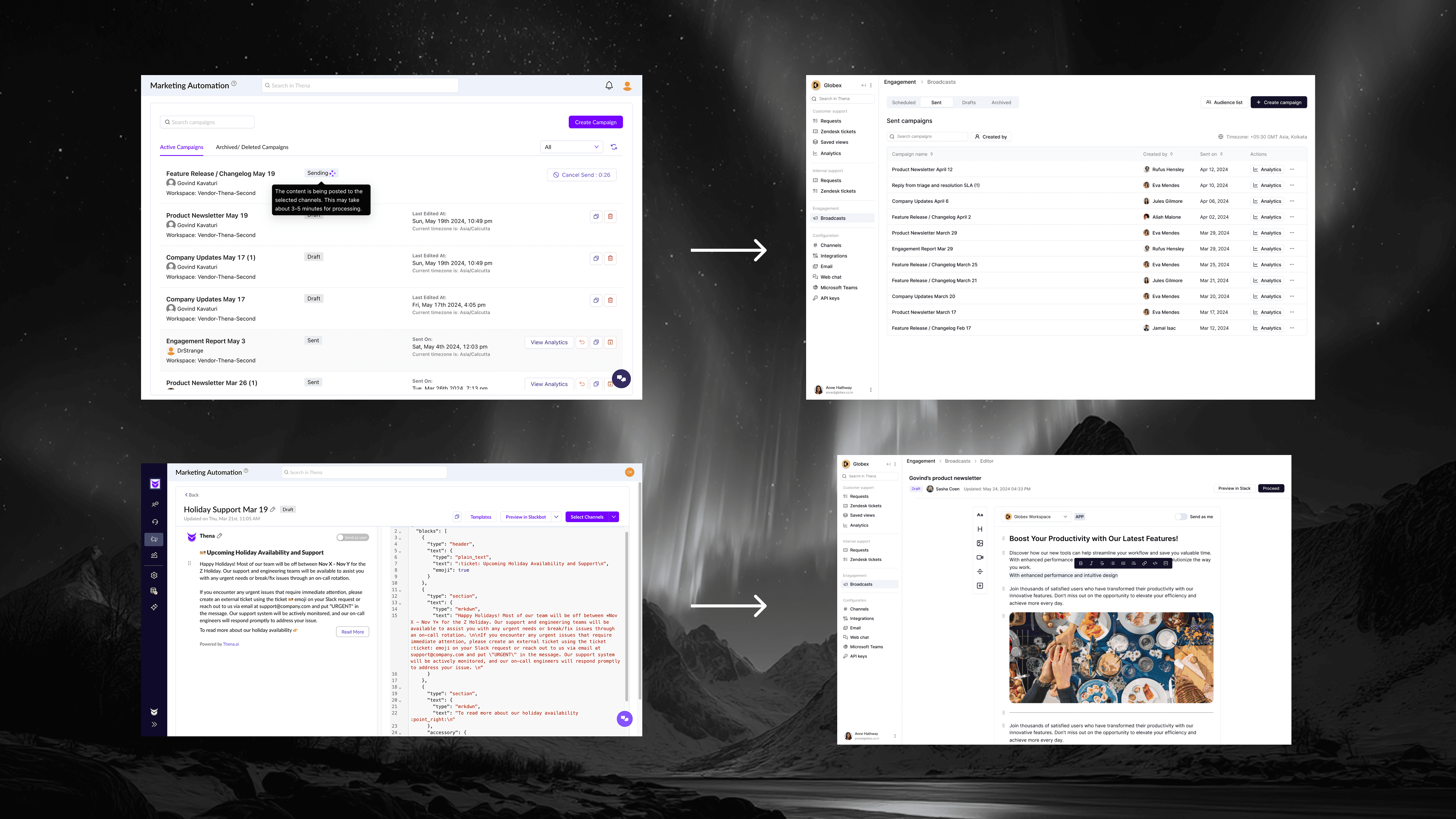
Broadcasts: From Afterthought to Feature
Before: "Marketing Automation" with card clutter and JSON editing.
After: Clean Broadcasts experience:
Tab system: Scheduled, Sent, Drafts, Archived
Visual template picker with actual previews (Product Update, Changelog, Dinner Invitation, Outage, Webinar)
Modern rich-text editor (no JSON in sight)
Audience selection with Dynamic/Static badges
Clear breadcrumb navigation (Engagement > Broadcasts > Editor > Select accounts)
Real-time preview ("Preview in Slack")
The renaming alone "Broadcasts" instead of "Marketing Automation", better reflects what customers actually use it for.
Visual Consistency: A Unified Language
With ShadCN as the foundation, everything finally matched:
Consistent button sizes and styles
Unified color system (purple accents, clear status colors)
Standardized spacing and typography
Consistent loading states (skeleton screens everywhere)
Predictable interactions (hover states, transitions, feedback)
The product went from feeling like five different products stitched together to feeling like one coherent experience.
The Results
Usage: 20x Increase
Product usage went from ~600 minutes per week to 9,000-10,000 minutes per week, touching 12,000 minutes/ week at peak.
Not 10%. Not 2x. Twenty times more usage after the overhaul.
And this wasn't vanity metrics. Out of roughly 1,200 users, ~800 were monthly active users—a 67% MAU rate. Users weren't just signing up and forgetting about it. They were coming back, daily, living in the product.
Revenue Growth: $400K → $1.3M ARR
Revenue growth has many factors, sales, positioning, market timing, new features.
But here's what I do know: when the product works, customers stay. When customers stay, they expand. When they expand, they refer others. The overhaul created a foundation where all of that could happen. It removed the friction that was causing churn and blocking expansion.
The UI wasn't the only factor. But it was the prerequisite for everything else.
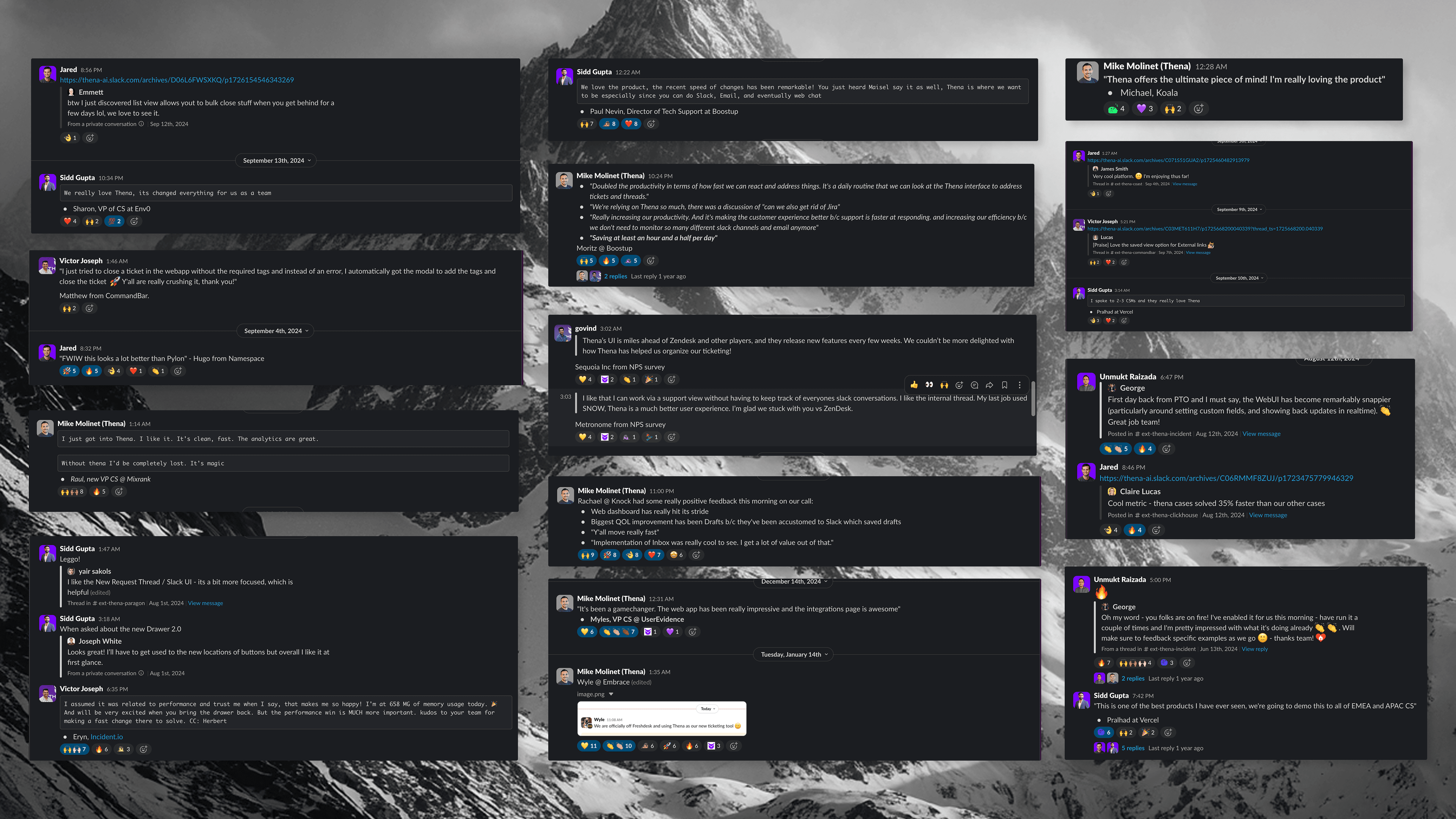
Customer Sentiment: Complete Flip
Before: "The UI is confusing." "It's too slow." "We might need to look at alternatives."
After:
"UI is miles ahead of Zendesk. One click on any view versus a bunch of clicks to get to view." — Sequoia Inc
"I absolutely love thena. It's a gamechanger - the web app is impressive." — Myles, UserEvidence
"Y'all move really fast with features and quality UI, it's impressive." — Rachael, Knock
"The Web UI does feel remarkably snappier today. Happy to report! 🙂" — George, Incident.io
"Cases solved 35% faster using Thena." — Claire, ClickHouse
"I'm officially off Freshdesk! 🙌" — Wyle, Embrace
"Much better UX than SNOW, glad we stuck with you vs ZenDesk." — Metronome
The feedback wasn't "it's fine now." It was "this is better than the competition."
What This Enabled
The overhaul wasn't just about fixing what was broken. It created a foundation for everything that came after.
With a coherent design system in place, the team could ship new features rapidly:
Inbox & Notifications: A new unified view for all alerts
Help Center & Knowledge Base: Customer-facing documentation
Workflows: Automation rules and triggers
Role-Based Access Control: Enterprise-grade permissions
Insights: Analytics and AI reporting
Customer Portal: Self-service for end customers
Each of these would have taken months in the old system, figuring out how to make it fit, dealing with inconsistencies, fighting technical debt. With the new foundation, they shipped in weeks.
The overhaul also bought time for the backend rebuild and AI-first product development that came later. You can't innovate on a broken foundation.
The Lesson
Designers are often seen as bottlenecks. We're the ones who slow things down with our "polish" and "attention to detail." We ask for more time, more iterations, more refinement.
Sometimes that reputation is earned.
But it doesn't have to be that way.
Designers can be accelerators. We can make decisions that speed up engineering instead of slowing it down. We can choose systems that scale. We can ship quality at speed, not quality or speed.
As the founding designer, I had a choice. I could keep making incremental improvements—safe, low-risk, slow. Or I could step up, take full ownership, and rebuild.
The Thena overhaul worked because I approached it as a builder, not just a designer. I didn't just make things look better. I made them shippable. I reduced friction for engineers. I caught issues before they became bugs. I moved fast without dropping the quality bar.
Six weeks. One founding designer. A complete product transformation.
That's what's possible when design becomes an accelerator instead of a bottleneck.